Root to Route
Collaborative Senior Design Show
LOCATION: Muncie, Indiana
PROJECT: Senior Design Show
ROLE: Researcher | Designer | Curator
OVERVIEW
Root to Route was a collaborative senior design show that was designed and curated by myself and fellow peer Leah Callahan. When we approached each other about possibly completing a senior design show we realized that we wanted to collaborate one last time before we wrapped up our college years and end on a positive note. Although we shared the ebb and flows of this journey together, we each individually have our own accolades and accomplishments that we wanted to highlight too — focusing on our journey as a whole and how our roots led to the routes we travel today — thanking all the people that have shaped us as individuals and designers.

Event Identity Design
The goal of our show was to reflect on our past opportunities, express our love for design and our collaborating process — through celebrating our growth, accomplishments, failures, and our journey. We wanted to create design pieces both collaboratively and individually that are solely us — not influenced by a project description or scope. Root to Route is our reflection on the past four years and the journey of where we came from — our roots — to where we are heading next — our route. This is our past, our present, and our future. This is who we are — from our roots to routes.
Identity Concept Sketches


Identity Inspiration

Identity Process
EVENT COLLATERAL

Poster

Postcards


Postcard
Social Media Profile

Postcards

Postcards & Vinyl Stickers

Root to Route Instagram


EVENT SPACE & SETTING UP PROCESS


Show Statements
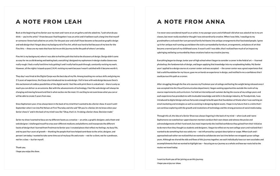
The artist statments allowed each of us to reflect on what this show meant to us and our individual artist's statements allowed us to reflect on the journey we took to become Graphic Designs and our hopes for the future after we enter the professional industry.


Root to Route
Root to Route focuses on our college journey by depicting our successes, failures, and the opportunities we sought out — both as individuals and collaborators. Root to Route is broken down by semester — highlighting key events that occurred during those periods of time through writing and photography. All of the events are connected and displayed in chronological order visually creating a timeline.
.
PRELIMINARY SKETCHES


DIGITAL LAYOUT
FINAL INSTALLATION


Style Guides
Throughout the past 4 years as designers, we have both created multiple style guides for clients, studio projects, and even for our own personal brand. We wanted to challenge ourselves to design a style guide for each other because we are so often thought of as the same although we each have our own unique design aesthetic. We each designed a style guide for the other— complete with icons, color palette, typography, visual aesthetic, and a write-up on our visual style and how we see the other as a designer.


FINAL INSTALLATION


STAND DISPLAYS


I AM ___
I AM ___ was a coded to represent how we are both similar but very different as individuals. Each of us chose adjectives that correlated with a topic or theme and it was interesting to realize that although we are often compared to one another as being similar we are actually very unique and are have are own separate likes and dislike. After the piece was coded we both thought, “I guess opposites really do attract”
HTML/CSS

HTML/CSS KEYFRAMES


Root to Route | I AM ___
FINAL INSTALLATION


Destination
Destinations was a series of mosaic tile designs of places that each of us have visited over the past 4 years. Traveling is such an enriching experience that has taught us more about cultures, people, and we can be exposed to a variety of art. We were inspired by Nick Misani, a freelance designer in NYC, famous for his historic digital recreation of mosaic tiles, in his series Fauxsaics.


Reflection
Reflections is an editorial piece that we created to fully explain and showcase the journey that we went on over the past 4 years. We each answered questions regarding where we came from and how we got to Ball State (our roots) as well as our future plans and hopes after post-grad (our routes). We rounded out the editorial by added photos and typography that were more playful and supported our answers. Digital lines were included on top of the photography to emphasize specific characteristics of each other and to incorporate the brand we established for the show.
LAYOUT SKETCHES

EDITORIAL


EDITORIAL PHOTOS


FINAL EDITORIAL
 |  |  |  |  |
|---|---|---|---|---|
 |  |  |  |  |
 |  |  |  |  |
 |  |  |  |  |
 |  |  |  |  |
 |  |  |  |  |
 |  |  |  |  |
 |  |  |  |  |
 |  |  |  |  |
 |  |  |  |  |

Care Package
The care package was a design that reflected people and items that have been essential and made an impact on helping me get through college. Each can is representing coffee but the flavors represent specific people and all the instructions on how to "brew" the coffee differs for each flavor or person. This care package was a fun and personal way to thank those who have been on this college journey.


Letters to Myself
Letters to Myself was a series where I wrote a reflection letter to my past self before I went to college and a hope letter which is my hope for my future self post-graduation and later in life. These letters were a reflection of my own journey these past four years of lessons I've learned, how to move past failure, and how to remain humble during success.


